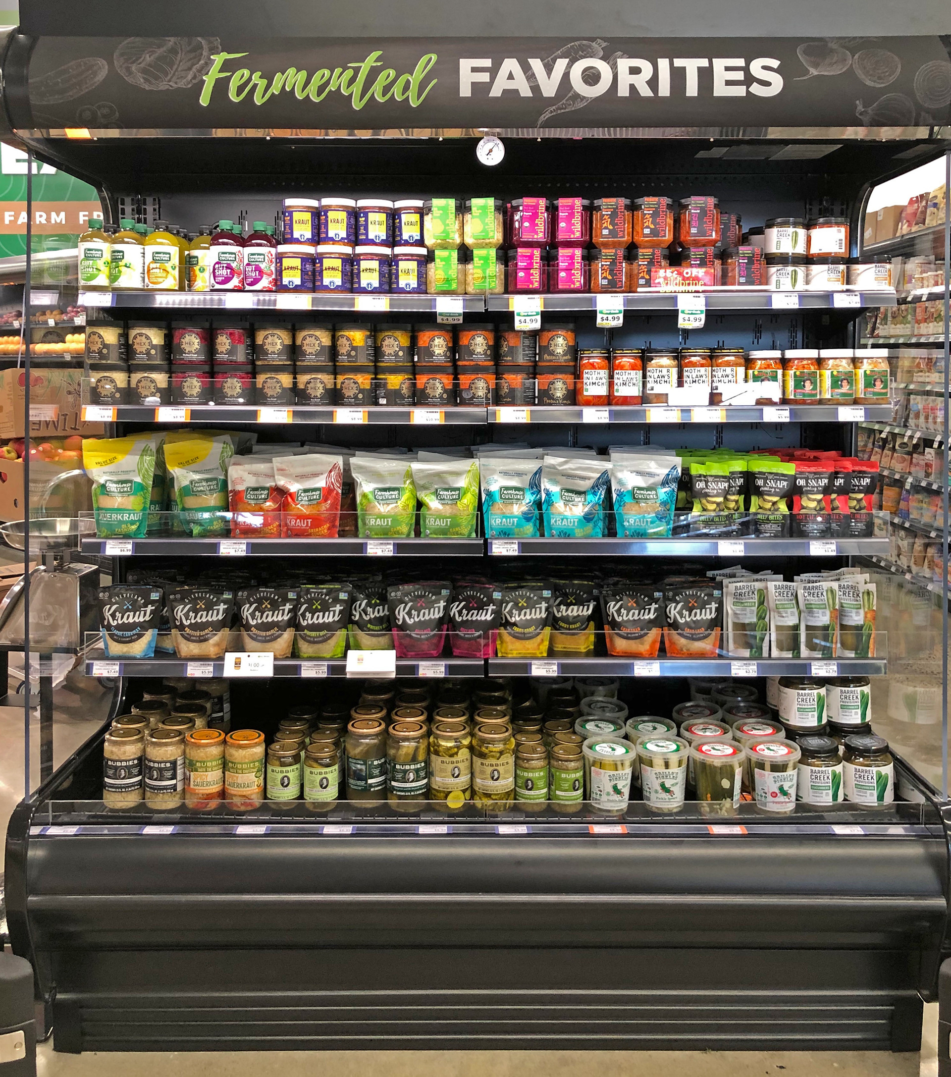
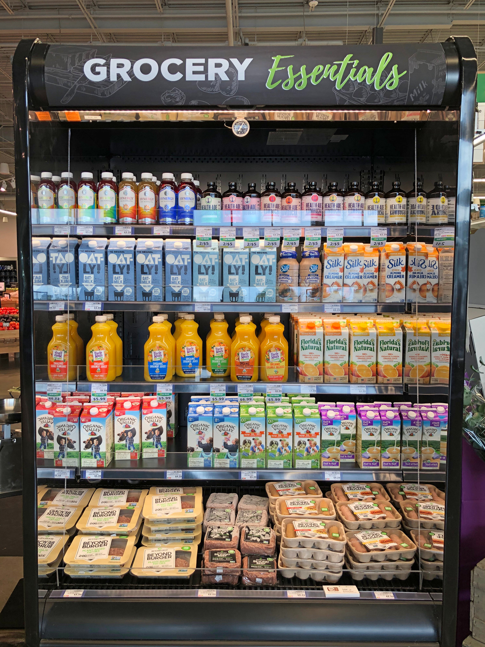
The expansion of Common Market to open a second location allowed for the process of creating signage that would be more permanent and universal. At the original store location, signage was always thought of as something that can change on a dime without realization of the time it takes to design, produce, and install, as well as the overall cost with labor and materials.
Throughout the construction of the second store location, consideration was put into how both locations can stand together as a whole and what could be done to create a more cohesive brand and easier sign design process. The administration/marketing team would be housed at the new location and not be able to travel to the original location frequently to swap signage. New fixtures for the second location were of larger scale and swapping frequently would come at a higher cost.
For this project, I suggested generic signage that would always speak to the product in the cases or shelves below. Common Market also wanted to keep the chalkboard signage feel that was used at the original store. I incorporated the usual brand and chalk sign fonts with the Common Market color palette to design vinyl graphics that spoke to the products and used texture and imagery that tied into where the sign would be placed. Each sign was hand measured, cut, and applied after designs were approved.